This tutorial demonstrates the fundamentals of graphing
data with Excel.
Those who are unfamiliar with Excel may wish to first read
The Basics of Using Excel.
Those interested in other applications of Excel, particularly
as they apply in the curriculum, should see Grading
with Blackboard and Excel and Collecting
Data with Excel.
There are several ways that one might graphically display data, and Excel
makes it fairly easy.
A Simple Graph
A simple graph of multiple sets of related data is a common goal.
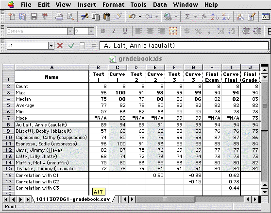
- You begin a graph by selecting
the data you want to display, in this case the names of the students and each
of their test scores:
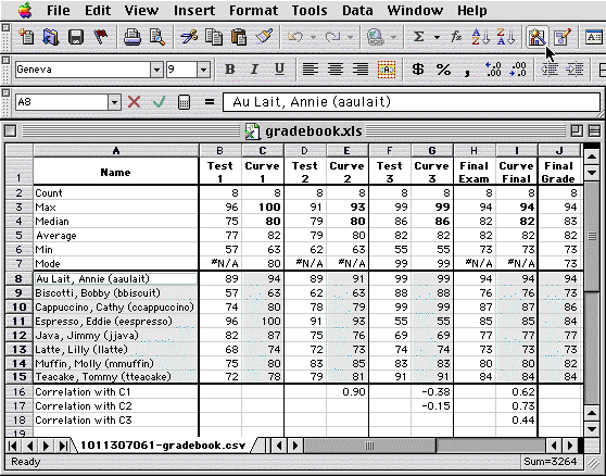
- You then click on the Chart Wizard icon in the Standard Toolbar (see where
the cursor is pointing above).
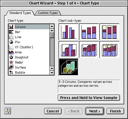
The Wizard first brings up the Chart Type dialog:
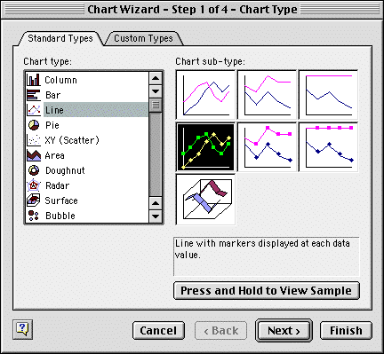
For this example we will choose a line chart, and in particular the one shown,
with markers.
(The other chart sub-types in the first column only vary the chart appearance,
while the second and third columns espress the data as additive and percentage-wise
complementary, respectively.)
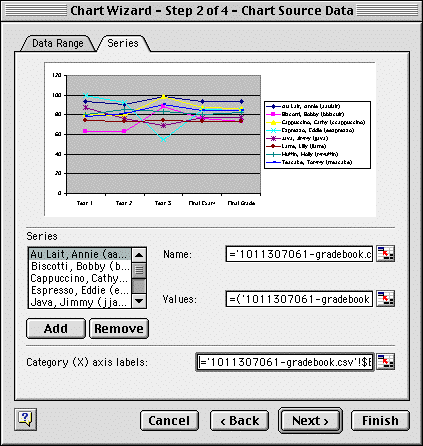
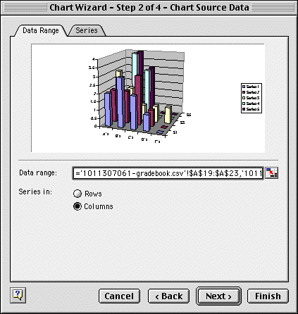
- When you press the Next button, the Chart Source Data dialog appears:
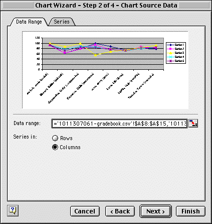
Here you are given a preview graph and an explicit description of your data,
allowing you to modify your selection.
In this case, it's displaying each test as a curve, with each vertical column
of data being a student.
Note that Excel is smart enough to realize that the column of student names
must be labels.
(But if the first column is numbers, it will be made a separate curve, not
the abscissa or "x values".)
- You can reverse the relationship by selecting "Series in: Rows":
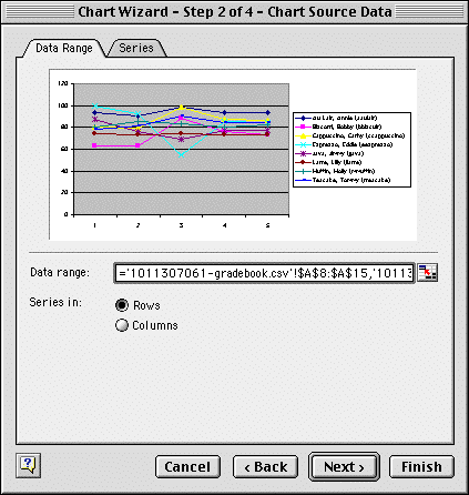
Now each curve is a student, and the vertical columns are the test values
for the students.
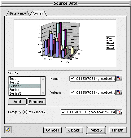
- Next click on the Series tab, which allows you to further describe the data:
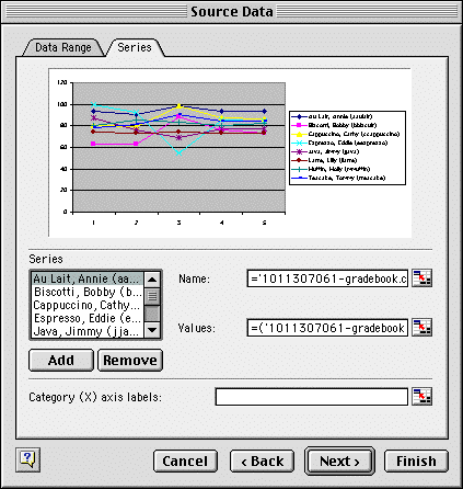
Clicking in the field "Category (X) axis labels:" allows you to
label the graph by selecting the test names from the spreadsheet:
This will add them as labels to the preview graph:
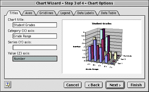
- When you press the Next button again, the Chart Options dialog appears:
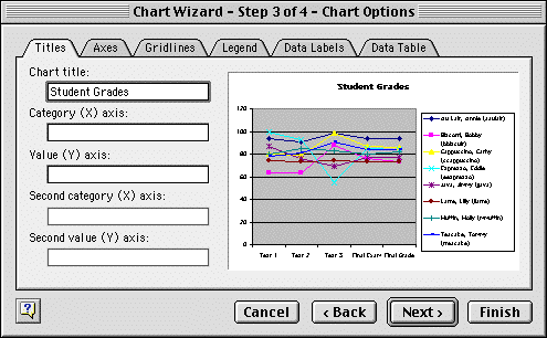
You can then type in additional labels, such as the Chart title above.
- When you press the Next button again, the Chart Location dialog appears:
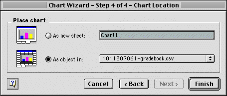
Making the chart an object and pressing the Finish button will place the graph
adjacent to the data in the spreadsheet:
Note that Excel automatically distributes colors and symbols amongst the different
curves, and picks a scale for the vertical (Y) axis.
- There are numerous formatting options for such graphs, a couple of which
we'll discuss here.
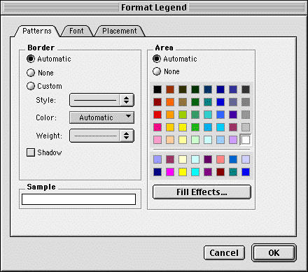
By double-clicking on the graph legend (with the student names), you can change
its characteristics:
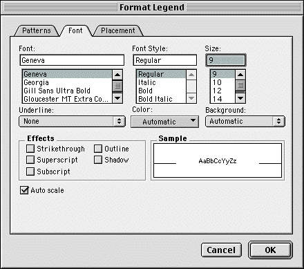
Clicking on the Font tab allows you to change the font to something smaller
and less obtrusive:
- The graph's vertical (Y) axis can also be modified by double-clicking on
it, which brings up the Format Axis dialog:
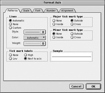
Clicking on the Scale tab lets you choose the minimum and maximum values of
the axis, the spacing of tick marks, and other details:
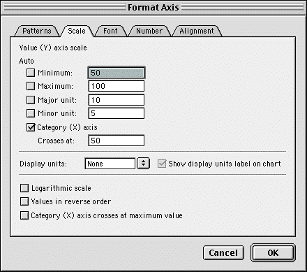
Here the Minimum, Maximum, Major unit, and Minor unit have been changed from
their default values (and have therefore become unchecked).
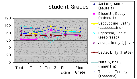
- The resulting graph is then:
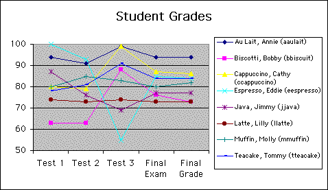
The fluctuations that lead to negative
correlations for Test 3 can be clearly seen here.
The most inconsistent student is Eddie Espresso (probably due to all of the
caffeine he consumes!).
A Histogram
With Excel one can set up and graph histograms, showing the frequency of particular
ranges of data.
- Excel has an explicit histogram function in its Data Analysis Toolpack,
in the Tools menu, but it may need to be loaded first as an "Add-In"
(also under the Tools menu).
It's a bit cumbersome to use and it doesn't automatically update.
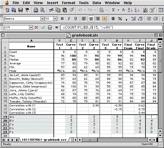
We will therefore build our own using the CountIf function, which compares
a cell to a numerical condition and counts it if the condition is met:
#A = CountIf(C, ">=90")
#B = CountIf(C, ">=80") - #A
#C = CountIf(C, ">=70") - #A -
#B
#D = CountIf(C, ">=60") - #A -
#B - #C
#F = CountIf(C, "<60")
The calculation looks like this in Excel:
We can graph these results as before, again beginning by selecting the data
to graph, above.
This time we'll use a 3-D column (bar) graph:
We'll plot the data in columns:
But again we need to supply labels to the regressing axis, under the Series
tab:
Here each series of data must be selected, the name field clicked, and then
the label chosen from the spreadsheet (or you could just type it in).
Continuing to the next dialog, you can type in the chart title, and now also
two axis labels:
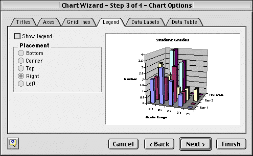
This time we'll remove the legend, by clicking on the Legend tab and then
unchecking Show legend:
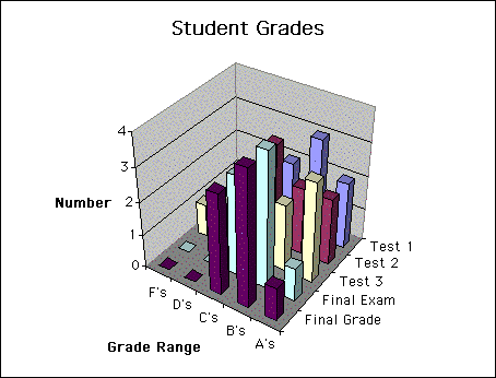
Finishing the graph results in the following:
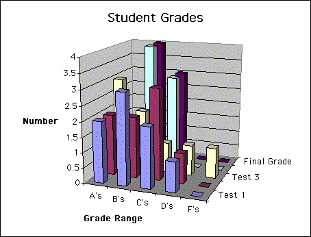
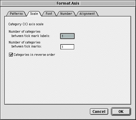
Clicking on the Grade Range and Test axes provides a dialog whose Scale tab
allows you to reverse their direction:
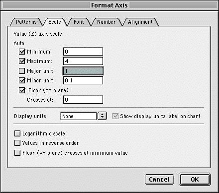
Clicking on the Number axis allows you to put the tick marks only on the integers
by changing the major unit from 0.5 to 1:
Finally, you can orient the graph so that the data is a little more visible
by clicking on one corner and dragging it around:
The final result is:
|